
Choosing a colour palette for your brochure is like selecting a persona for your brand and brochure. Like any aspect of branding, it is important to make sure the colour theme you choose represents your brand and the vision.
Here at Instant Print, we know all about printing. Check out our tips below on how to choose a colour palette for your printed brochure.
What Could Make Your Brand Kit?
You will likely have to use colours that are consistent in order to help consumers recognise your brand. Start with the brand logo and your website/ or storefront.
What colours do your consumers associate with your company? Is there a set colour palette in place for the branding? Brand recognition is all about consistency as well as its novelty.
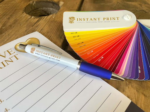
Stick to Two or Three Colours
In order to keep the concept interesting and to keep the branding compelling, you need to consider what the vision for the end product will look like. Keep it simple as simple means clean and no muddled messages.
The principles of design means every aspect has intention. For example, if your brand has two colours, then choosing a third complementary colour accentuates the other two that consumers already associate with your brand.


What is the Purpose of the Brochure?
What are you hoping to convey with this piece? As previously mentioned, all aspects of design have intention and purpose in order to evoke the message.
If you want to inspire hope, light blue may be a good complementary colour. If you are discussing finances, green may be a good option. Red introduces the idea of authority, blue of cleanliness and trustworthiness, and so forth.
Use Imagery as an Inspiration.
If there are images that need to be featured within the brochure, then they can be an excellent resource for determining a brand kit. The best way to do this is to download a sampling tool and choose from the options already provided. Google Chrome Extensions like 'Colorzilla' is a perfect tool for this!
Don’t Overthink It.
As colours are largely subjective, it can be easy muddling your thoughts trying to perfect the perfect palette. Trust your intuition and branding as well as your design preferences and go from there.
If you have any other questions about brand development, feel free to get in touch at anytime as we specialise in brand development.