
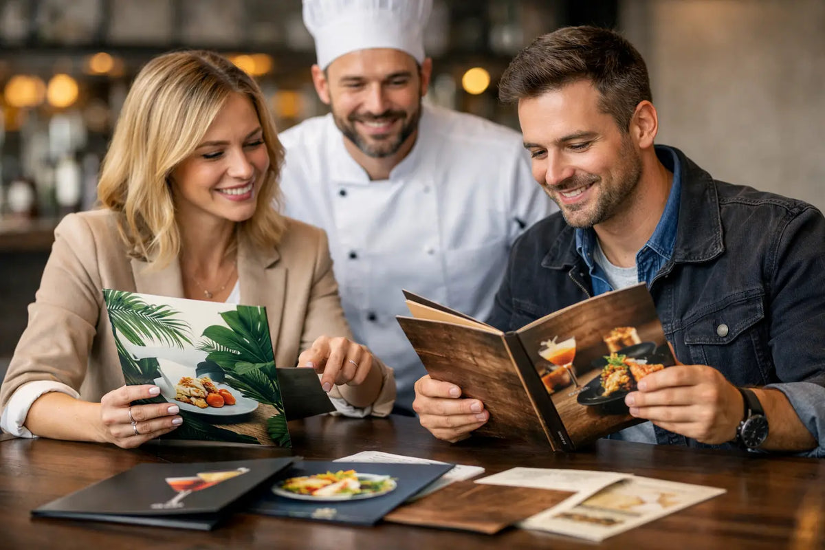
A menu is often the first piece of your business a customer properly reads. Before the food arrives or a drink is poured, it sets expectations around quality, price and personality. Knowing how to create branded menus means turning a list of dishes, services or packages into a useful sales tool that feels recognisably yours.
For a busy café, pub, restaurant or event venue, the best menu is not necessarily the most elaborate. It is easy to scan, comfortable to hold, accurate at the point of service and built to cope with its working environment. Your colours, logo and typeface should support those jobs, not compete with them.
Start with the job your menu needs to do
Before opening design software, decide where and how the menu will be used. A laminated breakfast menu that sits on tables all day has different requirements from a folded wine list, a takeaway leaflet or a one-night wedding menu. Size, stock, finishing and layout follow from that decision.
Think about the customer journey. Are guests ordering at a counter, waiting at a table, taking a menu home or reading it in low evening light? If your menu changes every week, you may need a cost-effective short run with space for updates. If the core offering stays consistent, investing in a stronger stock and protective finish can make better commercial sense.
Also be honest about how much information customers need. A restaurant menu may need dish descriptions, dietary information and prices. A salon price list needs services grouped in a logical order. An event menu may be mostly about presentation, but it still needs to be legible at a glance. Trying to fit every detail onto one page is a common reason branded menus become difficult to use.
Build your brand into the menu from the outset
Your menu should feel like it belongs beside your signage, business cards, social posts and printed flyers. That does not mean placing a large logo at the top of every page and stopping there. Branding comes from a consistent set of choices: colour, typography, imagery, tone of voice and the amount of space you give each element.
Use your established logo files rather than a screen grab or a low-resolution image. Vector artwork is ideal for print because it stays sharp at any size. If you only have a PNG or JPEG, make sure it is high resolution at the size it will appear. A blurred logo immediately takes the edge off an otherwise polished menu.
Choose one main typeface for headings and one easy-to-read font for item names and descriptions. Decorative scripts can work beautifully for a wedding menu or a specialist cocktail heading, but they are rarely suitable for every line. Small text, tight spacing and pale lettering on a busy background may look attractive on screen yet be frustrating in a dimly lit dining area.
Colour needs the same practical judgement. Your brand palette may include a deep navy, a bright orange or a subtle pastel, but print colour should also provide enough contrast for reading. Dark backgrounds with reversed white text can look premium, particularly on a drinks menu, although they can show scuffs more readily and may need a heavier stock or laminate. A lighter background is often easier to update and more forgiving in everyday use.
How to create branded menus with a clear layout
Good menu design directs the eye. Customers should be able to find categories, prices and key choices without needing to hunt for them. Start by grouping items into clear sections, such as breakfast, sandwiches, mains, sides, desserts and drinks. Keep category names consistent and leave enough white space between sections so the page can breathe.
Place your most profitable or signature items where they will naturally be noticed. This might be near the top of a category, in a small highlighted panel or beside a simple icon. Use these devices sparingly. If every dish is marked as a recommendation, none of them stands out.
Keep descriptions useful rather than overly long. Mention the flavours, key ingredients or point of difference that helps someone decide. For example, a local supplier, house-made sauce or vegetarian option may matter to customers. Just make sure the wording matches your business personality. A relaxed neighbourhood café can sound warm and conversational; a formal dining venue may prefer a more refined approach.
Prices deserve particular attention. Align them consistently, use a clear size and avoid cluttering each line with unnecessary symbols or styling. Customers should never have to ask whether a price relates to one item, an add-on or a sharing portion. If service charges, allergen notices or availability conditions apply, include them clearly at the foot of the menu or in an appropriate supporting panel.
When working across more than one page, repeat key cues such as the logo, page style and section headings. A single-sided sheet can be quick and affordable for a daily special, while an A4 folded menu offers more room for a full food and drinks range. For a premium feel, a smaller folded format or a bespoke shape may suit your brand, but only if it remains easy for staff to store, clean and replace.
Choose materials that suit real service
Paper choice changes how a menu feels in the hand and how long it lasts. A lightweight uncoated sheet works well for disposable event menus, inserts and short-term promotions. It has a natural feel and is easy to write on, which is useful for a chef's special or a personalised place setting.
For menus handled repeatedly, a heavier silk or gloss stock gives a more substantial finish. Silk is a popular all-round option because colours reproduce well and text remains easy to read. Gloss can make food photography and bold colour pop, although reflections from overhead lighting can be a consideration.
Lamination is worth considering for table menus, drinks lists and any piece likely to meet spills, fingerprints or regular wiping. Matt lamination has a refined, less reflective appearance; gloss lamination brings more shine and colour intensity. Neither choice is automatically better. The right finish depends on your venue, lighting and brand style.
If you need prices or dishes to change frequently, avoid overcommitting to a large run of fully finished menus. A practical alternative is to print durable menu covers with interchangeable inserts, or to order smaller batches as seasonal ranges change. Short-run digital printing can help independent venues keep stock current without storing boxes of outdated menus.
Prepare artwork properly before print
A professional print result starts with properly prepared artwork. Set your document to the finished size required and add a 3 mm bleed around every edge where colour, photography or patterns run to the trim. Keep important text, logos and borders safely inside the edge. This prevents a close cut from affecting vital details.
Use high-resolution images, ideally 300 dpi at their placed size. Images copied from social media are commonly too small for print, even if they looked fine on a phone. Convert or create artwork in CMYK where possible, as screen RGB colours can shift when printed. A bright digital blue or fluorescent green may not reproduce exactly as expected in standard process inks.
Always proofread from a customer and staff perspective. Check dish names, prices, serving sizes, dates, opening times, allergens and contact details. Ask someone who did not write the menu to review it too. They are more likely to notice a missing decimal point, an unclear heading or a price that has been carried over from an older version.
It is also sensible to print a test copy at actual size before approving a full run. Read it at arm's length and in the lighting customers will experience. A clear proof can reveal whether type is too small or whether a dark background needs more contrast.
Keep menus current without losing consistency
A branded menu should not become static simply because it has been professionally printed. Seasonal ingredients, supplier costs, new offers and changing regulations all require updates. Keep an editable master file with your approved logo, colour settings, fonts and layout rules. That gives your team a reliable starting point whenever a price list or menu section needs revised.
For cafés and pubs, consider separating permanent core menus from changeable specials. For venues and event organisers, create a small family of matching items: a main menu, drinks list, table number, place card and welcome sign. The set will feel considered without every item needing identical artwork.
If you need a hand with file checks, stock choices or creating artwork from scratch, a local production partner can save time and prevent costly reprints. Instant Print NI can support the design, print, finishing and delivery process, whether you need a handful of menus for a private event or a larger run for multiple locations.
A menu earns its place when it makes ordering easier and your business more memorable at the same time. Start with clarity, apply your brand with purpose, and choose a finish that can keep pace with the way your customers use it.