
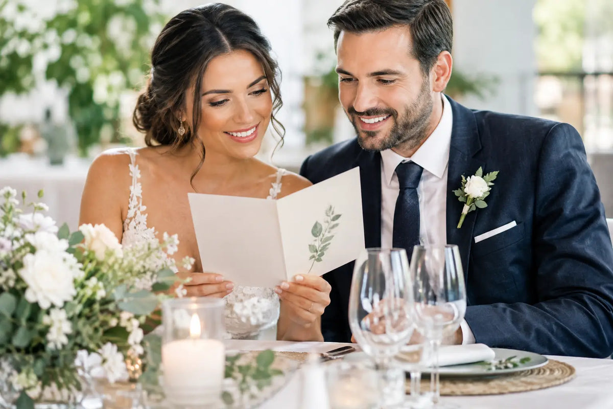
A beautifully dressed table can lose its polish quickly when guests are left wondering what is being served, whether the vegetarian option is theirs, or when dessert will arrive. Wedding menus do more than list food. They make each place setting feel considered, help the catering team communicate clearly and give your reception styling a finished, personal touch.
The best choice is rarely the fanciest one. It is the menu that suits your meal, table layout, budget and wider stationery, then arrives printed accurately and on time. Here is how to make the decisions that matter before your order goes to print.
Start wedding menus with the meal service
Before choosing paper, size or typography, confirm exactly how food will be served. A formal three-course plated meal needs a different menu from a grazing-style celebration, a shared banquet or a food-station reception. The format should answer the practical questions guests will have without making the card crowded.
For a plated meal, list each course in serving order, with a short, appealing description beneath the heading if space allows. Keep the wording supplied by your caterer where possible. They will know the correct dish names, ingredients and dietary references, and this avoids a last-minute discrepancy between the menu and what is served.
For shared or family-style dining, explain that dishes are served to the table and name the main elements. At a buffet or station-based meal, a menu is still useful, but it should guide rather than duplicate every label at the food table. Use it to set out the stations, service timings and any memorable details, such as a late-evening snack.
If guests choose between main courses in advance, there are two sensible approaches. You can print one universal menu showing all choices, or create individual menus marked with each guest's selected dish. The second option feels especially thoughtful but requires careful guest-list management and a final, confirmed catering spreadsheet. It is worth doing only if there is enough time to check every name and meal choice properly.
Choose a format that earns its place
A menu card at every setting is traditional for good reason: it is easy to read, photographs well and gives each guest a keepsake. A flat A5 card works well for a longer meal, while A6 is often enough for a concise menu. A tall, slim design can suit narrow tables, provided the type remains comfortably readable.
For a more minimal table, a single menu per table may be the better call. This reduces print quantity and leaves room for flowers, candles and glassware, but ensure the text is large enough for everyone to read from their seat. One menu between six or eight guests can become a nuisance if it is small or hidden behind a centrepiece.
Folded menus bring extra space and can double as a place card when a guest's name is printed on the front. They are particularly useful when you need to include a drinks list, order of the day or a note about sharing dishes. They do involve more finishing and assembly, so allow for that in both your budget and schedule.
There is also no rule saying every menu must sit flat. A menu can be tucked into a folded napkin, tied to a favour, clipped to a linen runner or displayed on a small easel. Check the venue's table-setting plan first. The place setting needs to remain functional, and anything near candles, food or glassware should be secure.
Match the menu to your stationery, not just the décor
Your invitation suite gives you a strong starting point. Repeating the same typefaces, colour palette, illustration style or monogram makes the day feel joined up, even when the menus are simple. You do not need to copy every detail exactly. In fact, a cleaner version of the invitation design often reads better at a smaller scale.
The table setting should influence the final choice too. Dark menus with white ink can look striking, but they need proper contrast and suitable print production to stay legible. Pale ink on a busy floral background may look lovely on screen and disappear in a low-lit reception room. Ask yourself how it will read under evening lighting, not only how it looks on a mobile phone.
Write menu wording guests can understand
Food descriptions should sound appetising, but not mysterious. A guest needs to identify the dish quickly, especially where allergies, religious requirements or dietary choices are involved. Lead with the main ingredient, then add the supporting flavours and garnish. For example, roast fillet of beef with dauphinoise potatoes, seasonal greens and red wine jus is clearer than an overly elaborate chef's description.
Use consistent capital letters, punctuation and spacing throughout. Decide whether courses will be headed Starter, Main Course and Dessert, or simply listed in sequence, then stick with it. Include dietary markers only when they are accurate and useful. A small key such as V, VE or GF can help, but it is not a substitute for the catering team's allergen process.
A short personal line can make the menu feel less formal. It might welcome guests to the meal, thank them for being there or mention a family recipe that inspired one course. Keep it brief. The menu should still be easy to scan while guests are talking, settling in and enjoying the room.
Paper and finish change the feel
Paper choice has a bigger effect than many couples expect. A smooth uncoated stock gives a soft, understated finish and is easy to write on if names or meal choices need to be added. A heavier textured or lightly flecked stock brings warmth to rustic and natural styling. Silk or gloss finishes can give photographs and bold colour a cleaner, more contemporary look.
Thickness matters too. A thin card can feel lost among charger plates and linen, while an unnecessarily heavy card can add cost without improving the design. Your printer can recommend a stock that holds its shape, suits your chosen finish and works with the quantity you need.
Foil, raised elements and specialist finishes can create real impact, particularly for names, borders or a monogram. They also add production time and may not suit a tight deadline. If the budget is limited, invest first in a well-designed layout, quality card and clean print. Those choices will always be noticed.
Leave room for production details
Build your artwork at the finished size and include the required bleed where colour or imagery reaches the edge. Keep names, borders and text safely inside the trim area. Fine lines, very small type and pale text can be unreliable in print, so use them carefully rather than relying on what looks sharp at high screen resolution.
Proofread in stages. First check spelling, dates and names. Then compare every food description against the caterer's latest version. Finally, print a home proof at actual size to test the reading order and text size. It is much easier to spot a crowded line or missing course on paper than on a laptop.
Order a few spare menus for the top table, suppliers and any unexpected changes. If you are using named versions, order a small number of unpersonalised extras too. They give you a practical backup if a place setting changes on the day.
Printing wedding menus without last-minute pressure
Menus are often one of the final wedding items to be confirmed because food choices and guest numbers move late in the planning process. That is normal, but it makes a clear production plan essential. Set an internal deadline with your caterer, allow time for proof approval and avoid leaving the order until the week of the wedding unless the design is very straightforward.
For couples across Northern Ireland, Instant Print NI can help take the production side off your list, from checking artwork and selecting a suitable card through to printing, finishing and delivery. If your menu needs to coordinate with invitations, place names, table plans or welcome signage, sharing the full stationery direction early helps keep the result consistent.
The most memorable menus feel easy for guests to use because every decision behind them has been considered. Choose wording that is clear, a format that suits the table and a finish that reflects the celebration. Then give yourself enough time to hold the finished card in your hand before the first glass is poured.