
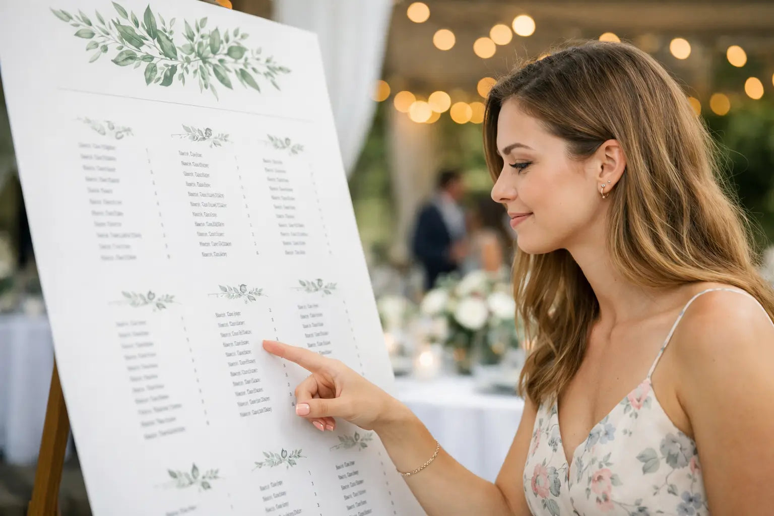
The moment guests reach the reception room, they want one thing: to find their table without squinting, queuing or asking three different people for help. Good wedding seating plan printing turns a necessary bit of wedding admin into a polished welcome point - and keeps the room moving when it matters.
A beautiful seating plan is not simply a list of names. It needs to work at the venue, in the available light, at the distance guests will stand from it, and with the style of everything around it. Getting the print specification right means it looks considered in photographs and remains genuinely useful on the day.
Start with the venue, not the screen
It is easy to design a plan around a laptop preview and only later consider where it will sit. Instead, ask the venue where guests will enter, whether the plan will be indoors or outdoors, and whether an easel, table or display stand is available. A plan positioned beside a busy doorway needs a larger format than one displayed in a calm drinks reception area.
For most weddings, A2 is a practical starting point for a modest guest list. It is compact enough for an easel or framed display, yet offers enough room for a clear table layout. A1 gives names more breathing space and is usually the safer choice for larger receptions, long surnames or a layout with 10 or more tables. If guests need to read it from a couple of steps back, bigger is nearly always better.
Portrait layouts suit alphabetic lists and tall floral or illustrated designs. Landscape can work well for a wide table chart, especially when names are arranged in neat columns. Neither is automatically better. The right choice depends on your number of tables, your design and the display position at the venue.
Make the seating plan easy to scan
Your guests should be able to find their name in seconds. That means clarity comes before decorative detail. Keep names at a readable size, use strong contrast between type and background, and avoid pale text on photographs or busy watercolour washes.
There are two main ways to organise a plan. Listing guests alphabetically, followed by their table number, is fastest for larger groups. Grouping names beneath each table title feels more personal and suits a smaller wedding, but it can take longer to scan. Some couples use both: an alphabetical index on one side and table groups on the other. This can be useful, although it needs a generous format to avoid cramped text.
Check every name carefully before sending artwork to print. A seating plan is one of the few wedding pieces where a spelling mistake is particularly visible to the person affected. Confirm surnames, preferred names, table numbers and any late changes against the final RSVP list. It is also worth asking one person who has not been involved in the planning to proofread it. Fresh eyes catch duplicated names, missing guests and numbering gaps surprisingly often.
Choose table names with the layout in mind
Table names can add personality, whether you choose local places, favourite songs, flowers or holiday destinations. Keep them short enough to sit clearly above the guest list. A lengthy table title may look lovely in isolation but can force the names beneath it into an unreadably small size.
If table names are not obvious, pair them with numbers. “Table 4 - The Orchard” gives guests two ways to find the right place and helps venue staff direct people quickly if needed.
Select a material that suits the day
The best material depends on how and where the seating plan will be displayed. A lightweight paper print can be ideal when it is going into a frame. A mounted board is more self-supporting and has a substantial finish on an easel. For a one-day indoor event, both can look excellent.
A matt finish is a popular choice for wedding signage because it reduces glare from venue lighting and photographs well. Gloss can give colours extra punch, but reflected light may make names harder to read near windows or candles. If your design has subtle tones, white space and fine typography, matt is often the more forgiving option.
Mounted display boards are especially useful when you need something sturdy without sourcing a separate frame. They travel well when protected, stand neatly on an easel and give a professional finish to larger plans. A framed print may better suit a home-style venue or a design you would like to keep afterwards. There is no single premium option - the display method should lead the decision.
For an outdoor welcome area, plan for the weather even if the forecast looks kind. Wind, damp and uneven ground can quickly spoil an unprotected paper sign. Ask the venue about a covered location or move the seating plan inside the entrance. A board and a secure easel are generally more practical than a loose framed print outdoors.
Design for print, not just for social media
A seating plan may look perfect on a phone while becoming difficult to read at full size. Use high-resolution images and avoid enlarging screenshots, small web graphics or compressed photographs. Fine lines and pale details can also disappear once printed, particularly against textured or dark backgrounds.
Leave a sensible safe margin around the edge. Names, table titles and key decorative elements should not sit right against the trim line. This gives the finished plan a calmer appearance and allows for normal production tolerances.
When providing your own artwork, a print-ready PDF is usually the safest format. Set the document to the final size, use high-resolution images and include bleed where required by the product specification. If you have created the design in Canva or another template tool, download the correct print PDF rather than a standard image file. It is a small step that can make a noticeable difference to sharpness.
Not confident with artwork setup? It is better to ask before ordering than hope for the best. A good print team can check practical points such as size, resolution and whether the file is suitable for production. Instant Print NI can also support customers who need a hand turning a design idea into a finished wedding display.
Allow room for late changes
Wedding guest lists move right up to the final days. Someone becomes ill, a couple bring a named guest, or a family arrangement changes. Do not print too early simply to tick the job off the list.
A sensible approach is to finalise the table plan once RSVP replies are in, then allow a short window for genuine late changes before approving the artwork. Keep an editable master file and clearly label the version you have sent to print. “Final”, “final final” and “final newest” are an easy route to confusion when several people are making updates.
If timing is tight, prioritise a clear, accurate design over elaborate finishing. A simple A1 plan on quality stock is far better than a detailed display with incorrect names. Fast turnaround is valuable, but it still needs an approved file and enough time to check the result before the wedding day.
Do not forget the companion pieces
The seating plan works best when it matches the signs guests see next. Table name cards, place names, menus and a welcome sign do not need to be identical, but shared fonts, colours or motifs make the room feel pulled together. Ordering these items at the same time also helps you compare colours and finishes across the set.
Bring a spare copy if the budget allows, particularly for a large reception or a venue with multiple entrances. It can be a smaller duplicate near the bar or an alphabetic list for the coordinator. This is not essential for every wedding, but it is a useful safeguard where guests will arrive in waves.
A final check before it goes to print
Before approving your wedding seating plan, view it at 100% scale on screen or print a small test section at home. Can you read the smallest names comfortably? Are table numbers obvious? Does every guest appear once, and only once? Check the finished size, orientation, material and delivery date too.
The best seating plan does its job quietly: it welcomes guests, directs them with no fuss and looks right at home in the room you have worked so hard to create. Give it the same care as the invitations, and it will be one of the first details people notice for all the right reasons.