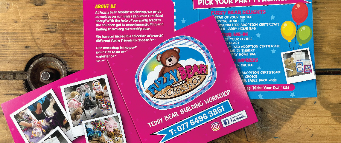

Advertising your business using printed, physical pieces of information is a powerful tool to get people intrigued. While the world is transforming towards digital ways of communication, traditional printing services like leaflets, posters and business cards still work just as well.
The main idea behind deciding to print a large number of pieces is to advertise an event or a business. What better way to do this than using the right attention grabbing colours?
Finding a Colour Printing Shop with great value deals is the first step, and if you’re struggling to find one, Instant Print Belfast is a great place to start.
Attention Grabbing Colour Printing
You can’t deny that a bright yellow leaflet won’t grab your attention, especially when there’s a really interesting image on it, screaming to be looked at.
This is exactly what you should be aiming to achieve when designing your print advertisement and if you’re questioning whether to use colour or not, the answer is-use it.What use would it be to make an informative piece to be printed, only for the information to get lost within a black and white palette.
Research has proven that using colour in print advertising increases a person's attention span by as much as 82%, makes your message 39% more memorable and increases your brand recognition by a skyrocketing 80%.
Colour printing and advertising is the way to go.
Colours Helps to Communicate Ideas
While colour is visually appealing to look at, it is crucial in communicating ideas across and making people understand them a lot quicker. Our minds decode messages within a piece of media by identifying signifiers and finding a meaning for them.
If a piece of the advertisement doesn’t automatically resemble what’s known to people to look a certain way, the message will simply not come across the right way.
A sky will be quickly recognised as one if there’s blue covering half of the leaflet, whereas if the colour was missing, you’d be left in a guessing game trying to determine what you’re looking at.
So there’s absolutely no denying that colour makes things easier for us to comprehend, simply because that’s what we know.
Symbolism of Colours
Everyone knows that colours have the power of influencing our moods and emotions, which is why we chose different tones for different parts of our homes.

Red
Associated with sacrifice, danger, and courage. Modern surveys in Europe and the United States show red is also the color most commonly associated with heat, activity, passion, anger, love, and joy.
Yellow
No wonder this is the happiest colour, as it’s the same as the sun which we all know makes everyone feel on top of the world. Using yellow is perfect in advertising cheerful events like parades and parties
Green
Symbolising harmony and health, it's no doublt this came from the peaceful feelings we associate with being among nature. Used for Good Luck, and being an important symbolic part of Ireland, green can be used to promote both pharamcies and Irish Gift Shops.
Blue
There is no doubt in saying that the calm symbolism behind this colour comes from the sea. Blue evokes feelings of trust, loyalty and honesty. Many meditation and therapy organisations will use this colour to show that you're coming to a peaceful place worth putting your trust into.
Purple
The Spiritual Colour, symbolising imagination and our inner growth along with royalty and luxury. This is the ideal colour to use when dealing with important and deeper messages, along with imaginative ideas. Many crystal and candlestick shops will use purple to create a spiritual atmosphere.
As you can see, colour plays a significant role in how we digest and understand information, and also how we feel when we see it.
It’s wise to use this tool to your advantage and be mindful in choosing your colour palette.
If you’re not sure how to begin the creative process of designing your print, we have some in house Graphic Designers who can take care of this for you.
If you’d like to go ahead and order your ready print design you can do so on our online site.
